
Have you seen restaurant websites that leave you less than impressed? I’m sure you have if you’ve spent any time at all searching for eateries on the internet.
Poorly designed websites leave a bad taste in the mouth of visitors and may contribute to low scores on internet search results. So how do you know when a restaurant site is well designed? Below are three things that every amazing restaurant web design must have!
An Eye Catching Design
As the Chef’s saying goes “we eat with our eyes first”, and this is never a truer statement than when discussing restaurant web design. The design of the website should set the customer’s expectation of what they’ll experience when they arrive at the eatery. It should reflect the style, personality, and ambiance of the brick and mortar restaurant.
Designing your restaurant site is like plating your menu items. You start with the background–the plate. Selecting the right background color sets the mood for the site; black will look dramatic and is well suited for an edgy appeal, where white evokes a clean, modern feeling. Using a white background for a rock & roll style restaurant wouldn’t accurately reflect the restaurants real personality.
So how do you select the appropriate colors? You should start with your restaurant’s brand colors to build your website design palette. Use a dark background to set a romantic or dramatic mood; a brighter background gives a more playful or modern feel. Then use your brand colors to add layers, dimension, and personality to the (virtual) pages.
Stunning Photos of the Food
A picture is worth a thousand words (yep, I’m into old sayings today—go figure), and fabulous photos of your restaurant and menu items will entice patrons to order online, or to visit your physical location. Pictures appeal to the viewer’s imagination, and set their expectation for what they’ll experience when they enter your establishment or order your food online. Using pics that accurately reflect your restaurant’s style is key to perfectly painting that mental image.
For example, a romantic Fort Lauderdale Italian Restaurant may use images of wine, candles, and a plate of their homemade mozzarella with prosciutto to communicate the ambiance of their establishment .
.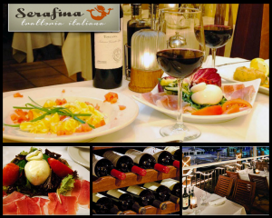
The aforementioned rock & roll restaurant might use photos of guitars, rock stars, and pub style food. Whatever the style of the eatery, it should come across on the web pages of the site.
Responsive for Mobile Devices
Responsive is just a fancy way of saying that a website is designed to fit on any mobile device screen. Why is this important you might ask? Well “81% of consumers have searched for a restaurant on a mobile app in the last 6 months” according to an article in the Wall Street Journal (online). Yep, that’s right eight out of every 10 people surveyed said they searched for a restaurant using their mobile device.
If a restaurant website and menu aren’t designed to be viewed on a mobile device, the restaurant could be losing business to a competitor whose site is mobile friendly. I know that I use my smartphone to access the internet more often than I use my computer, and I don’t stay on websites that aren’t conducive to mobile viewing.

Share This
Read Similar Articles
Stop Confusing Your Customers: Why Your Restaurant Brand Should Be a Lighthouse, Not a Disco Ball
Your restaurant has an Instagram account with bright, playful colors and casual fonts. Your menu features elegant script and muted earth tones. Your website looks like it belongs to a…

The Silent Marketing Revolution: Why the Smartest Restaurants Are Posting Less and Earning More
Every restaurant owner has heard the same advice: post daily, engage constantly, be everywhere your customers are, keep feeding the algorithm. It’s exhausting, it’s time-consuming, and here’s the part nobody…

Ring in Success: 7 Restaurant Marketing Must-Haves That Will Make 2026 Your Best Year Yet
Pop the champagne and grab your party hat, because we’re about to toast to something truly exciting: a brand new year packed with fresh opportunities to grow your restaurant or…